top of page

5 Borough Bike Club
A bike club for passionate pros and ambassadors dedicated to expanding and nurturing the bike riding community
Challenge
Membership in this nonprofit bike club is declining. Use brand and visual identity as a tool to grow or stabilize the community. The club must attract new members, retain current ones, and stand out as the friendliest cycling group in the five boroughs.
Client
5BBC is proudly known as New York’s friendliest cycling community. Whether you're just getting started, commuting with curiosity, or a seasoned rider, 5BBC offers rides for every level.
Skills
Brand Design, Visual Identity, Packaging Design, User Research, Market Research, Adobe Creative Suite, Cross-collaboration
Moodboard


Rebrand


Impact
-
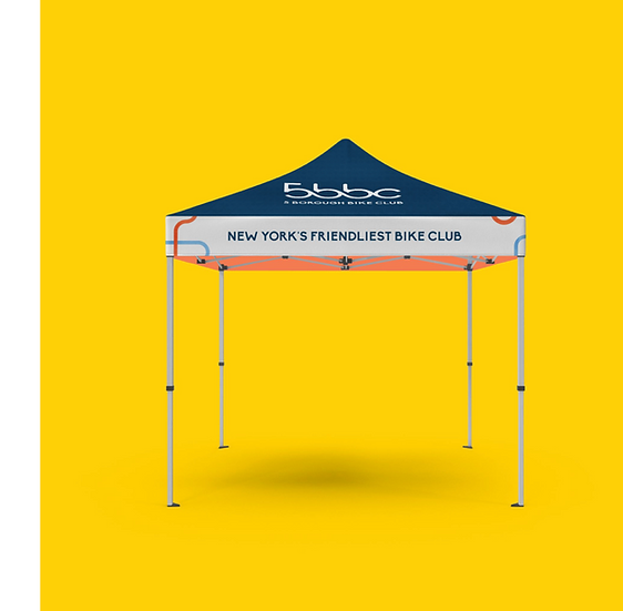
The 5BBC rebrand reimagines the bike club’s visual identity to reflect a more inclusive, dynamic, and forward-thinking cycling culture, one that welcomes
riders of all backgrounds and celebrates the diverse spirit of New York’s boroughs
-
By modernizing its look and feel, the club strengthens its role as a memorable, vibrant, community-driven hub for connection, exploration, and belonging
-
Successfully pitched visual rebrand to the President of the bike club with strong interest in its adoption

Competitive Analysis
© Arunima Sinha All Rights Reserved
bottom of page